Search This Blog by Google

Search This Blog

Welcome to Dijemeric Visualizations

Where photography and mathematics intersect with some photography, some math, some math of photography, and an occasional tutorial.

Total Pageviews

Saturday, August 22, 2020

Measuring particulate matter locally from Northern California Fires of late August using a Pocketlab sensor for PM 2.5 and some surprising results

 Air quality is not so great right now at 11 am on August 19, 2020 with particulate matter (PM 2.5) ranging up to 150 locally*.   I used a phone linked sensor to measure PM 2.5 around my house this morning and got some surprising results.  Inside PM 2.5 averaged 40 ppm.  When I went outside the readings started to drop going below 20 ppm.  This made no sense until I removed the sensor from my pants pocket and the results went up to 90.  I tried this a few more times (see attached graphic) and got similar results.  

The polyester material was acting as a fairly effective filter.  I then alternately covered the sensor with paper towel layers, first 2 layers then 1.  Removing the paper towels sent readings up to about 100 ppm and restoring the paper layer brought the readings back down to 20 (2 layers) and 40 (1 Layer).  One other observation was seeing a difference in whether the pants pocket zipper was open or closed.  The readings were lower when the zipper was closed, so having a mask that fits well is important if you really want that extra protection.  

So if you are wondering if you could use paper towels as an inner liner for a cloth mask instead of buying the commercial and mostly unavailable paper filter liners sold together with some cloth masks, maybe this info will help you decide.  

I may test other materials later, but this is dependent on an ambient air quality that I hope does not last.  


* https://www.purpleair.com/gmap?&zoom=13&lat=37.92674868882685&lng=-122.28011027597898&clustersize=23&sensorsActive2=10080&orderby=L&nwlat=37.988670840901264&selat=37.864774345189225&nwlng=-122.43795291208738&selng=-122.12226763987059

Sunday, November 13, 2016

Another Super Moon!!

Another Super Moon!!

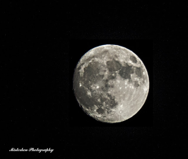
As the moon travels around the Earth it does so in an elliptical orbit that this year varied from 252,668 to 221,524 miles from earth.  The shortest distance this year of the moon to earth will occur on Nov 14, 2016.   Because the moon will be closer than usual, it will also appear bigger as shown in the diagram below.  


As a preview, here is a shot with a 300 mm lens and heavy cropping from my front yard on Nov 12, 2016.


For those who want to select a place and time to get your photograph, I suggest using the Photographer's Ephemeris (http://app.photoephemeris.com/) to calculate the best time and location for your shot. I plan on getting a shot as it rises above the UCB Campanile in Berkeley, CA.  


Good luck to those who grab there cameras and get some photos of the Supermoon!


Thursday, May 19, 2016

Crafting a macro to create a vintage postcard look with Nik software


Crafting a macro to create a vintage postcard look with Nik software
(c) Ken Osborn May 16, 2016

After visiting a version of Renaissance Italy at a local craft and performance fair in Vallejo CA, I
tried reinterpreting my photos as postcards depicting the era as might have been done in the 1930's.

Something like this:


To create this image took a few steps in Photoshop plus the Nik software plugin (free at https://www.google.com/nikcollection/)

If you have several images it is worthwhile to automate or at least semi-automate the process, as I did with the following macro (aka Action):


Some details

Make a couple of layers with your starting photograph


Blend 'Color' Mode on the top layer


Select the second layer down just below the 'Color' mode layer.  You will convert that to a monochrome version.


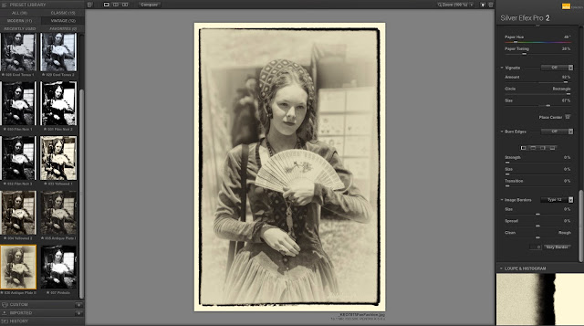
Select Silver Effects Pro in the Nik plugin

Where you will have several options to choose from

I selected Antique Plate II 


How it looks before adding color


Bring back the top layer in 'Color' blend mode and you have your postcard!


Saturday, January 17, 2015

Random Events, Trends, and Hot Temperatures


Random Events, Trends, and Hot Temperatures
(c) Ken Osborn Jan 17, 2015


Today's papers (Jan 17, 2015) say 2014 was the hottest on record since 1880. An engineering friend says the trend may be just a random thing. Could that be? Though the data do show a reasonable closeness to an independently produced set of random values with the same average and variability (standard deviation), I decided to test it by comparing the first half of 1880-2014 to the second half.

If random, dividing the data into two halves and ordering the values from lowest value to highest within each half would produce two superimposed sets that would be indistinguishable. If they are part of a trend of increasing temperatures, the sets would not superimpose and the second set would be shifted to the right on the chart. So which is it? Check out the graphs.
 [Data source: http://data.giss.nasa.gov/]


First, let me state that I do understand that random events can generate what appears to be a trend, as in this example:


Chart 1: Example of a 'trend' from a random generation of values 


The Random Walk chart displays what appears to be a strong trend with a correlation coefficient of 0.96, sufficient to earn an award for superior performance by an inebriated soul staggering along a mostly straight path.  I should note that it took over 50 runs of the program to get this result and doubt I could reproduce this particular set again.  


But if we can get a randomly generated collection of results to look like a trend, how do we know that our trend was not generated randomly?  

One way, of course, would be to rerun the events and see if we get the same trend.  However, since I'm looking at data collected from 1880 to 2014 that is not a realistic approach.  Another way would be to take the data, split it into two halves, and compare the two halves.  If the data are a random distribution around a central value, the first half of the data should match the second half of the data.  But first, let's try that with some randomly generated data.


Chart 2: Plot of 100 random values generated by a Monte Carlo simulation 
In chart 2, 100 random values ordered from low to high are plotted against their rank (probability). Half of the values exceed and half are below the average of zero and are symmetrically distributed around the center.  In other words, these data exhibit a nice Normal type distribution.  Note that the average and standard deviation for these data are the same as the temperature data to follow.  


So now if those data are split into two halves and each half is ordered independently from lowest value to highest value and plotted against its rank, what do we get?  


Chart 3:  Comparison of two halves of a randomly generated set of values after ranking each half
The values in blue represent the first half of 100 random values and the ones in red the second half.  Each half was then ranked from lowest to highest value and plotted against the ranking (1 to 50).  The superimposition is not exact, but these are randomly generated results so one should not expect an exact agreement between individual values.  But maybe a real trend would also show something like this.  Let's try it.  


Chart 4: A trend (Y= 10X+5) of 100 values partitioned into two ordered halves 
The trended data set of 100 values was generated from the formula Y = 10X+ 5.  The set was divided into two halves and each half was ordered from lowest value to highest value then plotted against its rank from 1 to 50.  Unlike in chart 3 with conformable data sets, these two sets show no overlap at all.  So how will this work with real data?  


Chart 5: Comparing the ranked temperature anomalies from 1880 to 2014 with a random data set  (Source: http://data.giss.nasa.gov/)

The values in green in chart 5 represent the temperature anomalies from 1880 to 2014 ranked from lowest to highest value.  Each value represents the deviation from the average for the 20th century.  The values in blue were randomly generated using the mean and standard deviation from the temperature anomaly set.  They do look as close as two separate runs of a random number generator.  But remember, the real test is to see if the first half of the data (1880 to 1946) matches the second half (1947 to 2014).  Any guesses?  


Chart 6: Comparison of two halves of the 1880-2014 temperature data anomalies


In chart 6, the values in red are for the years 1880 to 1946 and the values in green for 1947 to 2014.  Each set is ordered from its lowest to highest value and plotted against corresponding year.  They do not match and are clearly two separate distributions.  I leave the conclusion to you as to whether these data have been generated by random events.    


Monday, July 28, 2014

The Rise and Fall of a Flickr Photo


The Rise and Fall of a Flickr Photo

If you post photos to Flickr, you can see the views accumulate and then dramatically decline until there are few or no daily views.  This is expected, but what determines how many views are received and how rapidly the decline occurs?  Is there a relationship between the views on an individual image and its associated album?  Is there a reverse relationship such that a popular image can bring views to other associated images in the album? 

One of my images, On a Very Warm Day, got some extra attention when it was invited to the group Explore.  I hadn’t heard of it before, but once there the counts climbed dramatically, exceeding 1000 in a matter of hours.  I have a few images that exceed 1000 views, but it is usually after several months or even years.  While it is an appealing image, it was still a surprise.  But given this opportunity, I watched the statistics a bit more closely. 


On a Very Warm Day


I tracked the views over the first day during the count climb and then over the next few days as the views declined.  It is obvious that initial fame is fleeting and the counts go down rapidly.  After nine days the daily views declined to under 50/day from the initial 2000+ on day 1. 


Flickr Image Stats


When the Warm Day image views are plotted together with the views of all my Flickr posts, the two curves parallel each other (Chart I).  


Chart I: Image and Total Views Over a Nine-Day Interval


To see if there was a correlation, I plotted the cumulative image views against the cumulative total views (Chart II).  The correlation is 0.95 indicating a strong relationship between total views and image views. 


Chart II: Cumulative Image Views as a Function of Total Views


The fit indicates that for each additional 1000 total views, images views would increase on average by 444; at least during this 24 hour period.  This made me wonder if this relationship held over each of the time intervals for July 20.  For example, was it possible that during some of the time intervals, all of the views were due just to this one image?  


Chart III: Relative Increase in Image Views Based on Total Views Over Time

Chart III shows the slope of the image views plotted against time where the slope is relative to the total views.  The maximum value at 1:11 pm was 1.3, which means for an increase in total views of 100 the single image view increase was 133 – an impossibility since the total views include the image views.  While the cumulative total views always exceeded the cumulative single image views, it should also hold that the increase in total views during any given time interval should never be less than the single image views. 


So what now?  I suspect the discrepancy in the image view increase at hour 1:11pm is a bug in the Flickr views.  Initially I thought it was a typo on my part but have checked the numbers and don't think that is the case.  It makes sense that a strong image can bring in more traffic to other associated images, but this analysis makes a weak case to support that contention.  


Nonetheless, I had fun doing the analysis and may try to determine the source of the mysterious discrepancy.