Using LAB in Photoshop – Some Basics
Ken Osborn © 2012
L.A.B. is a color profile like RGB. Unlike RGB, L.A.B. separates colors into two
channels, the ‘a’ and the ‘b’, and the luminosity into a third, ‘L’,
channel. Thus working with L.A.B.,
unlike working in RGB, allows adjustments to the color independently of the
luminosity.
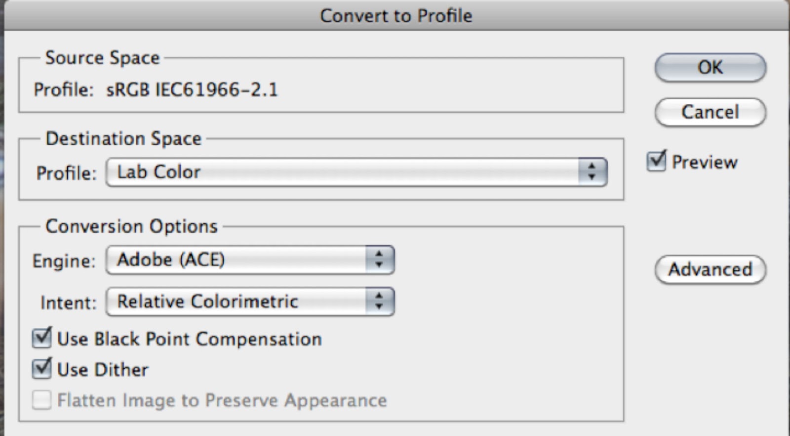
The default color mode in Photoshop is usually RGB. To convert an image from RGB to L.A.B. use
either the Image>Mode>Lab Color (Fig 1) or Edit>Convert to Profile
(Fig 2). Dan Margulis (“Photoshop Lab
Color”) recommends converting to profile.
Fig 1: Changing color mode
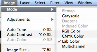
Fig 2: Convert to Profile
Before showing how to use L.A.B. on an image, I’ll give a
tweek or two using RGB so you can compare the results. I’ll use an image that I think has some
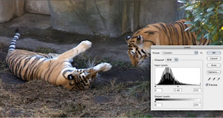
potential but is low in contrast and a bit soft (Fig 3). A quick Auto Adjust in Levels gives the image
a bit of snap (Fig 4), but maybe it could be improved a bit more.
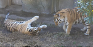
Fig 3: Two Tigers at the Oakland Zoo - a bit flat and could be a little sharper
Fig 4: Auto Adjust in RGB Levels - looks better
So let’s see what L.A.B. can do. Fig 5 shows the same image as Fig 1 after
conversion to L.A.B. There is no obvious
visual difference between the two images.
Fig 5: Original image converted to L.A.B. color profile - no differences yet
The histograms are different. The RGB histogram (fig 6, on right) shows the
pixel counts for pixel values 0-255 for each of the three color channels. L.A.B. separates the two color channels (a
and b) from the lightness channel (bottom of the L.A.B. histogram on left). While both graphic histograms use a plot of
counts vs levels (aka pixel values), the values in L.A.B. are specified
somewhat differently (Fig 7).
Fig 6: Comparison of RGB and L.A.B. histograms for original
image
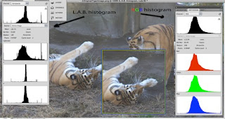
Fig 7: Color values compared for different color spaces at
middle gray
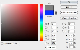
RGB has values of [128, 128, 128] for middle gray. L.A.B. has color values of [0,0] for middle
gray and 54 for lightness. If the values for a and b are
fixed at [0,0] any changes in the L channel will not change the neutrality of
the color. It can be changed from pure
white to pure black and every tone of gray in between but no changes to the L
channel will introduce any color.
Let’s take another look at the tiger image to see how this
works in practice. On the left side in Fig 8
the channel a curves slider has been moved to the left resulting in a magenta
cast. On the right side the slider has been moved to the right giving a
green cast. I call the a channel the
apple-green-magenta channel. Don’t know
if that will work for you, but if you look at Fig 9, you might guess what I’ll
use for the b channel!
Fig 8: Moving the channel a curves slider
Fig 9: Moving the channel b curves slider
Moving the b slider to the right adds blue and moving to the
left adds yellow. I call the b channel
the banana-yellow-blue channel. You saw
that coming, right? No? Doesn't matter but you might just remember it unless you eat magenta apples and blue bananas.
Let’s combine slider movements so they are symmetrically
equal as in Fig 10. Using channel b, the
tigers show a little more life with an equal boost to both the yellow and blue
components. That looks a little more
realistic. If the green and magenta are
also increased in channel a, it gets even better.
Fig 10: equal additions of blue and yellow in channel b
followed by equal additions of magenta and green in channel a
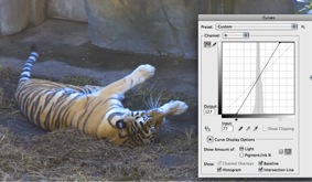
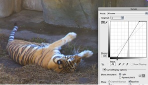
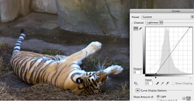
So far I’ve just changed the color but not the lightness
value. The image is still a bit flat,
lacking contrast. When the Lightness channel is adjusted, that changes as in
Fig 11. The tiger now has some life!
Fig 11: Bringing the tiger to life with the L channel
I could probably stop here, but I won’t because there is a
sharpening trick that works really nicely in L.A.B. Because the color channels are separate from
the lightness channel, sharpening does not affect the colors. I will combine this process with another for
one last attempt to give life to the tiger.
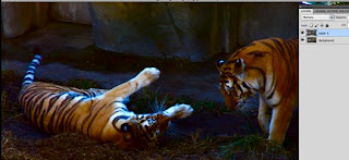
Duplicate the original layer and merge in blend mode
multiply. Egad! This is not an improvement! Stay with me.
Fig 12: Tigers thrown into the dark
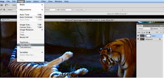
Now add a mask and Image>Apply Image as in Fig 13. Notice that the mask for the upper layer now
has some black inside the frame. This is
a selection that we can adjust to change both the luminosity and sharpness. Make sure the mask is selected before using Apply Image or adjusting the Feather slider in the following two steps.
Fig 13: Using Apply Image
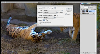
Make sure the ‘mask’ window is viewable (if not Window>Masks)
and move the feather slider to the right.
You should see a noticeable increase in sharpness as in Fig 14. Notice the Density slider. If this slider is
moved to the left, the effect of the mask is reduced and the image will
approach its original appearance. So if
you want it a little bit darker, go for it.
I’m leaving it where it is now.
Fig 14: Feather slider in Mask window to increase sharpness.
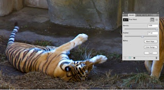
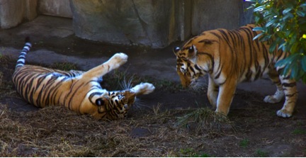
Fig 15: The tigers can now play
References:
Margulis, Dan "Photoshop LAB Color - The Canyon Conundrum and Other Adventures in the Most Powerful Colorspace," 2006, Peachpit Press, Berkeley.
Mark Lindsay, M.F.A. and a presentation to the Berkeley Camera Club on March 28, 2012
see Mark's work at marklindsayart.com