Search This Blog by Google

Search This Blog

Welcome to Dijemeric Visualizations

Where photography and mathematics intersect with some photography, some math, some math of photography, and an occasional tutorial.

Total Pageviews

Wednesday, June 22, 2011

Writing a How-to Procedure for Your Camera Club

Camera club "how-to' instructions bugging you? Have you just tried uploading an image for competition and wasted an hour because the instructions were not understandable? Do you sometimes think you could do a better job at writing instructions yourself?  I think you can.  Here are some suggestions and an example for writing a clear, concise, and usable set of instructions.  I am using a draft procedure from the Berkeley Camera Club as an example.  Now you should try the same with your group but you'll have to design your own logo!

"How-to" procedures for a club should conform to a standardized format.  At a minimum, each procedure should have a title, procedure number, and date the procedure was written.  If your group is growing, changing, or open to suggestions from your membership, also consider adding a revision number, group identification, and a group logo.

The logo, group identification, date, procedure number, and revision number should be placed in a header, as in figure 1 below.

Figure 1: Header Information

Below the header, place the title and text of the procedure.  The procedure can usually be divided into two parts, a background and a procedure.  The background provides an overview, purpose, and context while the procedure is the set of instructions to be followed.


Figure 2: Example Procedure, Page 1

Since you belong to a camera club, you are probably familiar with Photoshop, Lightroom, or some other software for processing images.  These can be useful in constructing written instructions, especially if you use screen shots that can then be imported into Photoshop/Lightroom for further processing.  The screen shot in figure 2, above, required no further processing to highlight the My Galleries selection.  Not all screen shots will provide such nice highlighting to direct the attention of the reader.

I like to use arrows, colored yellow or orange or red, to direct the reader's attention.  Draw an arrow in Photoshop and save it as a layered image (e.g., psd).  This will allow you to open the file later and use the arrow without having to remove the background.  Note that since the image below has been compressed (e.g., jpg), it has a white background, but the layered version has a clear background. 

Figure 3: Arrow to Direct Attention

Now that you have an arrow you can use it in any of the screen clips where you want to direct the reader's attention, like in page 2 of the example procedure in figure 4 below.

Figure 4: Adding Arrows to Direct Attention

That's about it, except you should always follow up with feedback and comments from others to find out if your procedure works the way you think it should.  And of course, after several months go by there will probably be some complaints and a rewrite.  That's where the revision number comes in handy.  And maybe you might help someone else do the revision!  


Sunday, June 19, 2011

57th Annual North Beach Festival

8074 The Beat Museum8108 Hand Out7895_6_7_Above the Hong Kong8109 Of Crowds and Costumes8112The Stinking Rose7945 Wall Dogs
7947 Live to Ride8039 Coit Tower7959 The Assay7956 W. P. A. Mural7979 Auto Ferry to Oakland7958 Art Deco Lite
7962 Over The Top7964_5_6_ Coit Tower View to the East7967_8_9_Coit Tower View to the North7973_4_5_ View to the West from Coit Tower7992_3_4_5_6_ Coit Tower7998 Last of the Natives
8002 Rock and Wood8038 Imagination8006 North Beach Crowd8040 Relaxing with a Heiniken8037 Victorian Inclinations8016 Columbus

North Beach is no longer the haven for poets, free thinkers, and other artists that it was in the 60's.

The North Beach Festival, now in its 57th year, has echos from that era but those echos are faint and perhaps unintelligible to those who did not live through those tumultuous times.

The Beat Museum is wonderfully quaint and evoked some distant memories making me think I might read Kerouac's "On the Road" and see if it was still relevant. Maybe not.

Coit Tower is still relevant and though I've been in the area many times had not seen the W.P.A. murals until now. Worth a return to the SFAI gallery to see Diego Rivera's murals.

And if you visit North Beach, try The Stinking Rose for dinner. The food's tasty and the atmosphere is great (lot's of garlic!!).

Saturday, June 18, 2011

Sketches and Skies of San Pablo Ridge

7872 Anise Light7869 The Trailhead7870 Feathers in the Sky7824SkiesAndRidgeCS3DuoSketch.jpg7871 Feathers in the Sky as Monochrome7828 Posts in a Field
7832 Anise Sketched7873 Belgum Palm7881 Broom Against the Skies7882 Pretty But Can Be Deadly7874 Skies Above7875 Cows in Richmond?
7877 Wind Swept Polarizations7858 Wind Swept7878 Wind Swept Pastel7879 Lupine Polarizations

When the skies become a canvas with clouds as the paint, a photographer can only hope to capture the art and perhaps reinterpret it.

Is this just photographing someone else's (Nature) art? Perhaps, but I'll still continue to try the impossible which is to capture the form, light, and shadow and perhaps the feeling of nature's art.

Thursday, June 09, 2011

Using Photomatix for Non-HDR Merging

Photomatix is stand-alone software that is used to merge bracketed exposures into High Dynamic Range (HDR) images. Such images have a range of tonalities that exceed what would otherwise be captured by a camera and can be quite useful with high contrast light. But Photomatix can also be used experimentally for non-HDR applications, such as merging two or more images with different subject matter.

(If you are new to HDR, see my tutorial HDR Basics )

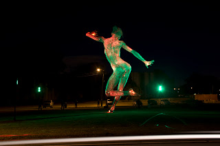
For example, in this image of Dance Bliss by artist Marco Cochrane I wanted to have her dancing with herself. This can be accomplished several ways, including using the Apply Image filter in Photoshop. But I did not care for the results that much, so tried merging in Photomatix.


Here is another shot from a different angle. Note that the dancer is in a space that has little detail in the first image.


Using Photomatix, I merged the two images but felt it needed something to indicate motion.


That motion came from an image created by zooming for a 2.5S exposure.


Merging the two versions of Dance Bliss with the zoomed shot produced Dancing Women:


Note that for this merge of 3 images, the boxes for Align Source Images and Reduce Ghosting Artifacts were unchecked. If you try to align the images, the software may try to align things that shouldn't (and maybe that's ok) and you get a cropped version like this