Search This Blog by Google

Search This Blog

Welcome to Dijemeric Visualizations

Where photography and mathematics intersect with some photography, some math, some math of photography, and an occasional tutorial.

Total Pageviews

Friday, December 21, 2012

People Behind the Numbers


A guest presentation by Linnea Hoover, Laboratory Supervisor 2012

Ever wonder how the quality of your drinking water is ensured?  A combination of good water sources, regulations that set the standards, water treatment infrastructure, and a testing laboratory.  But it takes people to operate the infrastructure and chemists, microbiologists, and technicians to test the water quality.  Who are these people?


Linnea Hoover, A former colleague who supervises a chemistry section at the East Bay Municipal Utility District's Laboratory, has combined her interests in science, photography, and art to show the human side of the laboratory.  In a gallery of photographs that display the many faceted personalities in the laboratory, Linnea has matched her staff with icons of art and history in a creative collection you can view at:


https://docs.google.com/open?id=0ByxHzIqC4EIYVEpPR0VyeUQ4UDA

While the photographic display shows that humor and science can coexist, it is important to remember that the people you saw in the gallery take their jobs seriously and understand the need to maintain and calibrate their instrumentation; perform tests to ensure the results are reproducible and correct; and that when the numbers say a substance is not analytically present its analytical absence is confirmed.  When coworkers understand their profession,  work as a team, and can even express joy in their work the product will show it.  


Wednesday, December 12, 2012

The Photography Challenge - A Progression in Time

(c) Ken Osborn 2012

I recently  joined a photography Meetup that convenes every two weeks to critique a photography challenge (http://www.meetup.com/Tinkering-Toms-and-Tammys-Photography-Group/).  The challenge for our second meetup was to capture a progression or stages of time, like the metamorphosis of a butterfly, frying an egg, or changes of the seasons.

I decided to assemble a progression in time with two photos I already had and were separated by several decades.  In fact I was not the photographer.  A few years ago I assembled a rather large collection of family photographs dating to 1889.  Some were still in excellent condition, but many showed the toll of time.  Months of work were required to restore many badly faded, mildewed, and otherwise noticeably aged prints.  There were two photographs that stood out: a great aunt-in-law, Anna Elizabeth Bell Graham, as a young woman and again in her late years showing a remarkable conformity.  While she had obviously aged, the shape and structure of her face was relatively unchanged and her presentation to the camera was the same in both photographs.  

I had some prior experience merging photographs of relatives to show the similarities and differences to others in the family, but had not previously seen such a judicious combination.  So I decided these photographs of Anna Bell would be assembled into a progression of time for the Meetup photography challenge. 

Anna Bell was born Jan 30, 1884 Anna Elizabeth Bell in West Shokan, NY.  The photograph below shows her at the age of five with her younger brother Charles.  Fortunately it was the practice of past generations to write information, in pencil, on the back of family photos.  That practice is seldom practiced today.  


When Anna's family moved to Illinois, she grew up in a rural setting surrounded by farmland.  


A photograph of Anna as a young woman in her late teens.


A photograph of Anna in her late years.


Using these two photographs and Photoshop, I created a sequence of five images showing how she might have looked over the intervening years.  

Mouse Click for Larger View

I did not know Anna Bell, but I leave one other photograph that has no information on the back and none of my in-laws know exactly when the photograph was made, but it is visibly neither when she was in her youth nor old age.  You can judge for yourself whether the sequence above has recaptured Anna Bell in the intervening years.  


Friday, November 30, 2012

Histogram Basics


Histogram Basics for Photographers
© Ken Osborn 2012
kozborn@sbcglobal.net

Light meter?  Isn’t that something like a sliderule?  A few photographers still use light meters but most of us depend on the histogram to tell us if an image is over or under exposed.  And some know about histograms but don’t use them because they rely on the camera to make all of the photographic decisions.  Nothing wrong with that if you have no desire or need for creative control, but if you’d like to go the next step and not let the camera make all the decisions, then this little tutorial is for you.


A histogram plots light received by the camera’s sensor with light value the horizontal axis and number of pixels on the vertical axis as in the plot below.

Light values for 8 bit pixels range from 0 (no light) to 255 (blown out highlight).  The next chart shows light value assignments and the relationship to the Adams Zone System numbers.  This makes for a total of 256X256X256 color shades when the Red, Green, and Blue (RGB) channels are combined for full color.  Our eyes can see more shades of color than that but it’s close enough and many color printers can’t do any better.


So how do you use a histogram for proper exposure?

Below is a properly exposed photo shot at sunset.  There are no blown out highlights or blocked up shadows.

Abandoned Building at Sunset

Now compare to the badly overexposed image below.


Here is the same photo with the histogram superimposed.


Note that the histogram is pushed to the right with no space on the right side: the highlights are blown.

An underexposed version of the same scene.

Perhaps you want that nighttime look.  That’s good and exactly why you want control over your shot.  Before you look at the histogram below, what will the curve look like?


Of course you knew the curve would be pushed to the left with the shadows blocked, yes?

So what does a ‘proper’ histogram look like?  If you don’t want blocked shadows or blown highlights, then you will want a histogram that has nothing extending to the edges, as in the next image.  


So that’s it. Properly exposed, a photograph should have neither blocked shadows nor blown highlights.  Shadow areas that are too dark have no detail and generally lack interest.  Highlights that are blown also have no detail and are usually distracting to the central features of the image.

And now you know what happens to the histogram if the shadows are too dark or the highlights are too bright.  Of course that is not to say that the artist’s intention was not have shadows without detail or highlights that dazzled the eyes.  After all, photography is an art.  


Sunday, November 11, 2012

Recapturing Your Pre-digital Memories

Remember Hi8 video?  If you are like me you will have several 20+ year old pre-digital analogue video recordings you may wonder what to do with.  You could just forget about them for several more years and let someone else worry about what to do with them or you could convert them to a digital format, put them on a hard drive, and even edit them for the memorable segments like your daughter's first steps, your visit to Paris in 1990, or the historic footage you shot and is now no longer possible because the old factory has been replaced with condominiums.

Having 30 Hi8 tapes representing over 50 hours of video, I decided it was time to recover some of the past and to perform the remastering from analogue to digital myself.  My setup for the process includes an iMac computer, a Sony TR700 video camera (the one originally used to shoot the Hi8 videos), a Elgato Video Capture converter, and cabling to connect camera to Elgato.  The Elgato takes both S-Video and Composite Video inputs and provides a USB output.  It records in the H.264 mp4 format, which maxes out at 640x480.  Seems low rez by today's standards, but Hi8 is not today's standard.  Elgato is simple to use but lacks on-the-fly controls although you can batch control brightness, contrast, etc through the Preferences settings.  More info on Elgato at http://www.elgato.com/elgato/na/mainmenu/products/Video-Capture/product1.en.html.

So far I've remastered some 20 hours of video and am mostly satisfied with the quality.  Some actually looks a bit nicer than the original when played directly from the camcorder to TV monitor.  Some of the converted footage exhibits 'jitters' which are generally not overly noticeable.

Once a tape has been converted to digital video (DV), it's possible to edit selections.  I used iMovie for that purpose.  I selected a 30 min segment from a 2 hour tape then edited it to a 7 min video, The Scotia Sawmill - 1993.  Scotia was a company town dominated by the Pacific Lumber Company (PALCO).  See http://en.wikipedia.org/wiki/Pacific_Lumber_Company for more information.


You may need to convert the video format and/or compress it for posting on your blog (Blogger limits file size to 100MB).  MPEG Streamclip, free software that will convert formats and compress video files is available for both Mac in PC at http://www.squared5.com/svideo/mpeg-streamclip-mac.html. 


Tuesday, July 03, 2012

OMG! I Just Lost All My iPhoto Photos!!!

So you've been storing all your photos using iPhoto and you didn't make a backup.  Not a good idea, but some folks still do that and even if you haven't and iPhoto says it's broken how do you get to your photos?

This happened to a friend and while some of her photos were backed up, there were problems with the backup.  Problems with backups are not always apparent until you decide you need to restore some files then find out what you thought was backed up isn't.  If this happens because something else went snapfoo your options rapidly dwindle.

So how do you access images stored in the iPhoto application when the application malfunctions?  iPhoto stores the images in folders under the Pictures master folder. The iPhoto application resides within the Pictures folder and acts to retrieve images in the Pictures subfolders.  However, it is possible to locate the hidden subfolders.  Let me explain how I did this on my MAC.  A similar process should work on a PC.

Even if you store your photos using iPhoto, you probably have one or more images stored elsewhere on  one of your hard drives, maybe even the computer's internal hard drive.    Enter the file name in the Finder search window and it will display the folders path of the file for each instance of the image.  You may have may but probably only one in the Pictures folder.  If several, check each one until you find a file path that includes iPhoto Library.  In this example, I have searched for a file named "0444 Alignments" and found four instances on my hard drives.  Only one of the files with this file name is located in the iPhoto Library.


While I cannot open the iPhoto Library if it is not working, I can open the 'Originals' folder.  In it are a series of subfolders by year with all of my photos uploaded to iPhoto.


Once you have come to this point, you are on your own.  Happy recovery!!


Wednesday, June 27, 2012

A Personal Photo Challenge - Seeing the Unseen

While making some chicken soup and thinking I should take a photograph, I looked around and saw there were other objects in the kitchen and nearby that did not look very photogenic.  What if I could see in the infrared?  What if I only saw shadows and highlights and nothing in between?  Could I make these dull and mundane items look interesting and still retain enough of their original features to be recognizable?

My personal challenge was to photograph these otherwise dull, mundane, and not so photogenic objects then process the images in-camera with the Pentax K5 filters to bring out features otherwise hidden and see if they could be seen differently.


Glad wrap never seemed 'glad' to me, so what if it were brighter, the colors more saturated, and made the box stand out against a black background.  Abstracted to unreality but definitely gladder looking!

You don't remember Easy Money?  Well you are younger than I.  Of course in real life we know there is no 'easy money' or 'free lunch' but there are those who would make us think so by claiming they can make us rich if only .... [fill in the blanks].   These charlatans must think their victims see things with a distorted view, so I used the distortion filter to make the Money look even easier.  But you should take a 'clue' and see that there is a 'risk.'  


Chinese Checkers!  When I was six I thought this was the greatest game there was and probably because of the bright colors and the sound of marbles thumping distinctly against the metal surface of the board.  That sound made it unlike any other board game.  That sound is still brought to mind when I look at the distinctive appearance of this Chinese Checkers board.


This is what the coffee pot looks like in the morning before consuming the first cup!


Not in the kitchen, but seen from the kitchen window, the view of the boulder has recently been slightly obscured by an Elderberry limb that fell in last winter's storm.  The boulder has a blue cast and the limb is a collection of linear features.  I processed one image to bring out the blue in the boulder and the other to bring out the Elderberry limb.  

Oh yes, what started all of this - the Kitchen Sink Chicken Soup!  I call it that because I toss in whatever veggies I can find in the kitchen, though I did not include the sink.


Recipe for Kitchen Sink Chicken Soup: sear 3 chicken breasts in a bit of coconut oil; add enough water to 2/3 of pot capacity; add veggies (sliced red potato, celery, mushrooms, carrots, etc); add spices (curry mix, turmeric, coriander, dash of vinegar, fresh ginger chopped fine, salt to taste). Bring to a light boil without cover for about 40-50 min (add water as necessary).


Sunday, June 10, 2012

How to Add an Event in Facebook


How to Add an Event in Facebook
Ken Osborn © 2012

You’ve found an interesting concert coming up in two weeks and want to post it on Facebook as an event to share with your friends?  Here’s how to do it.

1)    If you are not in your home page, go there.


2) On your home page select “Events.”


3) Here you will see any events you have been invited to or created yourself.  There will be a "Create Event" box.  Select it.  


4) Now you can fill in the specifics for your event and create it.

5) After creating your event, select invite your friends.

Friday, June 01, 2012

Customizing Your Twitter Page


Customizing Your Twitter Page
Ken Osborn © 2012

Did you know you can customize the background design of your Twitter page?  It’s easy, though not straightforward, so I thought it would be worthwhile to scribble some notes so I wouldn’t forget how to do it!  If it helps you, great.

The custom part of the design is the background.   I selected a background that matches my business card, then added the logo from my card, and contact information for my Flickr, Facebook, et al webpages.  For you, if the background is an image that you upload, you will need to build your image in Photoshop or Lightroom first. (I will not review creating the image, but note that I started with a Photoshop canvas 2048 wide and 1600 wide and a marker line at 300 pixels to restrict the area for text.)

Start with the home page, as in the example of my home page below.  But there is a problem with my first design.  After creating the background image and uploading it, I neglected to include my LinkedIn page.  To correct that omission I went to my profile page.  Under the head-and-shoulders icon on the right side (next to the quill in a box) there is a pull-down menu.  Go there and …


select View my profile page followed by Edit Your Profile.


Then select the Design option.


Once in the design page under Customize your own choose an image file from your hard drive and upload it for the background. 


The uploaded image will become your new background.  

My corrected webpage with LinkedIn link


Thursday, May 03, 2012

Using a Monte-Carlo Simulation to Model Natural Selection


Using a Monte-Carlo Simulation to Model Natural Selection

Ken Osborn © 2012

Darwin postulated that natural selection was the driver of the evolution of species diversity[1].   Elements of this model include 1) a selective agent as a reproductive threshold, 2) genetic variability (plasticity), and 3) a continuing process of genetic variation with each succeeding population.   In the Darwinian model of evolution, natural selection provides a reproductive threshold.  Individuals within a population whose genetics allow them to leave more offspring when challenged by the threshold determine the genetic direction of the population and the process leads to a “more fit” population, where fitness is defined in terms of the population’s ability to adapt to the threshold.  If the selective agent threshold is too high, the population may become extinct. 

For example, if color variation within a population of moths allows some moths to escape predator detection then predation pressure would act as a selective agent that would result in a change in distribution and abundance of color expression within the moth population.  Of course, the difficulty of finding camouflaged moths could act on the predator population as a selective agent driving changes that improved their abilities to detect prey.  Another example would be the effect of climatic variation on a population of Pika.  If genetic variation within the Pika population was insufficient to provide some individuals who could survive and reproduce in the presence of shifting summer temperatures, the Pika population would become extinct. 

Mathematically these elements can be modeled.  I have written a program in Excel using a Monte-Carlo process to generate a population of values that can evolve into another population of values in a “natural selection” process.  In the model, two numbers define a starting population: 1) the population average (mean) which represents Darwinian fitness, and 2) population relative standard deviation which represents genetic plasticity.  Once a threshold is set, the program generates a new population of values using the mean and relative standard deviation (RSD).  The Monte-Carlo equations generate a Normal distribution of values with mean = 0 and standard deviation = 1.  These values are converted using the population mean (fitness) and RSD (genetic plasticity).  Population values that exceed the threshold become the basis for the next population.  The process can be repeated with or without a new threshold. 

There are several observations I have made from this model.  Some seem reasonable and others are counter-intuitive.  All are potential candidates for testing, though some might be trivial and others cost-prohibitive.  I leave the testing for others to pursue. 

Figure 1 is an example of the program output.  The distribution of values will be referred to as a population.  Fitness is the average value of the population.  Spread is the standard deviation.  Plasticity is the relative standard deviation (RSD).   Adaptation is the percentage of a distribution that exceeds a threshold.  Options allow for specifying an initial and challenge threshold, where the challenge threshold is set at a level just below extinction.  The extinction threshold is one that exceeds the highest value in a population.  Survivors refer to population values that exceed a threshold.

The blue curve is for the initial population, Generation 1.  The vertical axis represents values of the population and the horizontal axis is the count of values (i.e., there are 100 individuals in the population).   The values have been sorted to provide a less complex visualization of the population distributions.  Individual values in Generation1 vary from a low of 159 to a high of 257 with a fitness mean of 203 and a plasticity RSD of 10.  Values of Generation 1 that exceed the initial threshold of 230 are used to create Generation 2.  A challenge threshold (250) was used to create Generation 4 from Generation 3 (not shown).  The table above the plot summarizes the population statistics for each succeeding generation. 


Figure 1: Monte-Carlo Evolution Program Output Example  (Run 1)

The most obvious observation is that there is variability around the mean fitness value.  Generation 1 ranges from a minimum of 159 to a maximum of 257.  Note that the relative range between maximum and minimum values decreases with each succeeding generation.  I will discuss this more.  That there is variability within a population is a trivial observation given that these numbers are generated using a random Monte-Carlo process, but it is worth noting. 

The second observation is that for a given set of initial fitness, genetic plasticity, and selective threshold the final outcome is only generally predictable.  Each run of the program will generate a slightly different outcome.  Figure 2 shows the second run with the same starting inputs for mean, plasticity, and threshold values as the first run shown in Figure 1.  The changes are small with a change in mean fitness for Generation 1 from 203 to 204, 241 to 240 for Generation 2, and 255 to 254 for Generation 4.


Figure 2: Run #2 for Initial Settings of Mean =200, RSD = 10, and Threshold = 230. 

Again, because this is a Monte-Carlo process this is a trivial observation.  The driver of genetic plasticity is genetic mutation, a constraint driven but random processes. A biological population with a specified fitness level and genetic plasticity would not respond exactly the same way to each instance of a natural selection challenge even if it were the exactly the same repeated challenge.  If this conclusion is generally valid, the implication is that smaller population size would lead to lower adaptability. 

The third observation is that for a given fitness and plasticity, there is a maximum threshold.  Setting the threshold above the maximum causes the program to crash.  I refer to this as the extinction threshold.  Because it is a Monte-Carlo process, there is variability in the extinction threshold.   A setting that causes a population crash in one run may not result in a crash in the next run.  In fact, the challenge threshold for Generation 4 of 250 was initially set high and was expected to result in a program crash (extinction).  It did on the third run, as seen in Figure 3. Generation 3 had no survivors to contribute to Generation 4. 


Figure 3: Setting the threshold above extinction


What happens if the genetic plasticity is increased?  If the initial fitness is fixed, changing the plasticity would be comparable to having two biological populations with the same overall average fitness but with different ranges from maximum to minimum fitness.  Figure 4 shows what happens when the plasticity for the first run is doubled from 10% to 30%.  Figure 4 shows that the fitness for Generations 2 and 4 has increased relative to run 1 even though the thresholds have not changed.  Generation 4, for example, went from a mean fitness of 256 to 285.  The increase for Generation 1 from 199 to 205 is within the run-to-run variability and not significant though the increase of the population maximum for an individual value from 243 to 334 is.  Note that it would not be expected for the fitness of Generation 1 to change with an increase (or decrease) in plasticity as it was not challenged with a threshold. 


Figure 4: Increasing genetic plasticity

At first it would appear that an increase in plasticity may not be of value as it not only leads to an increase in the maximum values in the population (243 to 334 for Generation 1), but also decreases in the minimum values (from 153 to 104 for Generation1).  Figure 5 used the input conditions for Run 3 with an increase in the Challenge Threshold from 250 to 280.


Figure 5: Increasing the Challenge Threshold after an increase in plasticity but a fixed initial fitness

The Challenge Threshold is set to affect only Generation 4 and the results are consistent with that condition.  The mean fitness of Generation 2 shows a modest increase, but is within the run-to-run reproducibility.  Generation 4, however, shows a much larger increase from 285 to 300 and both the max and min values have increased.  The significance for a biological population is that even if the population has some individuals that are well below the mean fitness, the population as a whole may be more responsive to environmental challenges. 

In this model of evolution, is genetic plasticity or genetic fitness a better predictor of adaptability?  I have rewritten the model to allow for multiple runs with a single set of input values for fitness, plasticity, and threshold.  The percentage of values exceeding a threshold (PECT) is a measure of adaptability. 

The model was run twenty times for each set of plasticity and fitness.  Column 1 is the Run number, column 2 is population 1 with fitness of 220 and a plasticity of 10, and column 4 is population 2 with fitness of 190 and a plasticity of 40.  The data are presented in Table 2 (note that there is no Table 1).  In this example, population 2 with the higher plasticity has the higher PECT (57.8 vs 11).  


This is somewhat counter-intuitive.  Consider if the players in a football team at school A were very evenly matched and all could bench press 200 plus or minus 10 pounds while players at school B could press 190 plus or minus 40 pounds.  You might think that the team with the well matched players and the higher average bench press capabilities would be more capable of achieving a 250 pound bench press challenge.  But in fact only 11% of team A could do that while 58% of team B could meet that challenge.

This mathematical model of evolution is a simple one and does not capture the complexity of biological evolution.  For example, predator-prey interactions, group selection, and eco-system feedback loops are not part of this model.  Given its simplicity, however, it has provided a surprising number of testable hypotheses:


  1. Increased genetic plasticity increases adaptability.
  2. There are limits to adaptability for a given plasticity and genetic fitness: a selection threshold that is too high will result in extinction. 
  3. In an environment where the threshold is changing, adaptation to a challenge threshold is greater for the population that has been subjected to the higher non-extinction threshold below the challenge threshold.
  4. As the selection threshold increases, genetic plasticity of a population decreases.
  5. Genetic plasticity can be a better predictor of adaptability than population fitness.


If you would like a copy of the 'Evolution' program, please write me.  You may use the program for your own purposes or post on your blog with credit.  You may not use the program for commercial purposes. Write me at kozborn@sbcglobal.net.  


[1] Charles Darwin, "On the Origin of Species by Means of Natural Selection, or the Preservation of Favoured Races in the Struggle for Life," 1859.

Wednesday, April 04, 2012

Using L.A.B. in Photoshop - Some Basics


Using LAB in Photoshop – Some Basics
Ken Osborn © 2012

L.A.B. is a color profile like RGB.  Unlike RGB, L.A.B. separates colors into two channels, the ‘a’ and the ‘b’, and the luminosity into a third, ‘L’, channel.  Thus working with L.A.B., unlike working in RGB, allows adjustments to the color independently of the luminosity. 

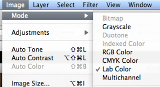
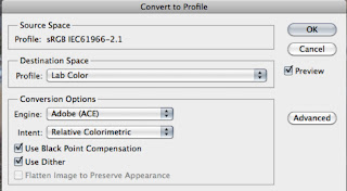
The default color mode in Photoshop is usually RGB.  To convert an image from RGB to L.A.B. use either the Image>Mode>Lab Color (Fig 1) or Edit>Convert to Profile (Fig 2).  Dan Margulis (“Photoshop Lab Color”) recommends converting to profile.

Fig 1: Changing color mode
 

Fig 2: Convert to Profile


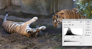
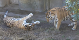
Before showing how to use L.A.B. on an image, I’ll give a tweek or two using RGB so you can compare the results.  I’ll use an image that I think has some potential but is low in contrast and a bit soft (Fig 3).  A quick Auto Adjust in Levels gives the image a bit of snap (Fig 4), but maybe it could be improved a bit more.

Fig 3: Two Tigers at the Oakland Zoo - a bit flat and could be a little sharper


Fig 4: Auto Adjust in RGB Levels - looks better


So let’s see what L.A.B. can do.  Fig 5 shows the same image as Fig 1 after conversion to L.A.B.  There is no obvious visual difference between the two images.

Fig 5: Original image converted to L.A.B. color profile - no differences yet


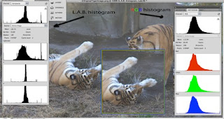
The histograms are different.  The RGB histogram (fig 6, on right) shows the pixel counts for pixel values 0-255 for each of the three color channels.  L.A.B. separates the two color channels (a and b) from the lightness channel (bottom of the L.A.B. histogram on left).  While both graphic histograms use a plot of counts vs levels (aka pixel values), the values in L.A.B. are specified somewhat differently (Fig 7).

Fig 6: Comparison of RGB and L.A.B. histograms for original image


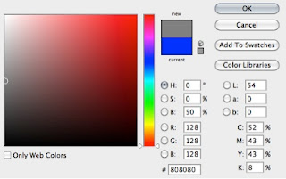
Fig 7: Color values compared for different color spaces at middle gray


RGB has values of [128, 128, 128] for middle gray.  L.A.B. has color values of [0,0] for middle gray and 54 for lightness.  If the values for a and b are fixed at [0,0] any changes in the L channel will not change the neutrality of the color.  It can be changed from pure white to pure black and every tone of gray in between but no changes to the L channel will introduce any color. 

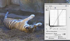
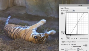
Let’s take another look at the tiger image to see how this works in practice.  On the left side in Fig 8 the channel a curves slider has been moved to the left resulting in a magenta cast.  On the right side the slider has been moved to the right giving a green cast.  I call the a channel the apple-green-magenta channel.  Don’t know if that will work for you, but if you look at Fig 9, you might guess what I’ll use for the b channel!

Fig 8: Moving the channel a curves slider

Fig 9: Moving the channel b curves slider


Moving the b slider to the right adds blue and moving to the left adds yellow.  I call the b channel the banana-yellow-blue channel.  You saw that coming, right?  No?  Doesn't matter but you might just remember it unless you eat magenta apples and blue bananas.  

Let’s combine slider movements so they are symmetrically equal as in Fig 10.  Using channel b, the tigers show a little more life with an equal boost to both the yellow and blue components.  That looks a little more realistic.  If the green and magenta are also increased in channel a, it gets even better. 

Fig 10: equal additions of blue and yellow in channel b followed by equal additions of magenta and green in channel a


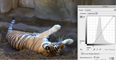
So far I’ve just changed the color but not the lightness value.  The image is still a bit flat, lacking contrast. When the Lightness channel is adjusted, that changes as in Fig 11.  The tiger now has some life!

Fig 11: Bringing the tiger to life with the L channel


I could probably stop here, but I won’t because there is a sharpening trick that works really nicely in L.A.B.  Because the color channels are separate from the lightness channel, sharpening does not affect the colors.  I will combine this process with another for one last attempt to give life to the tiger.

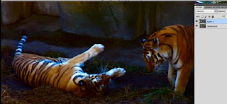
Duplicate the original layer and merge in blend mode multiply.  Egad!  This is not an improvement!  Stay with me. 

Fig 12: Tigers thrown into the dark


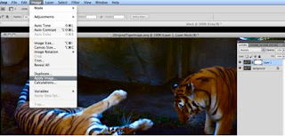
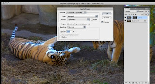
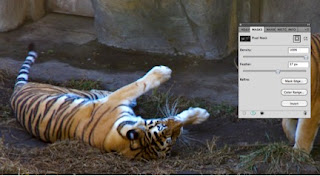
Now add a mask and Image>Apply Image as in Fig 13.  Notice that the mask for the upper layer now has some black inside the frame.  This is a selection that we can adjust to change both the luminosity and sharpness.  Make sure the mask is selected before using Apply Image or adjusting the Feather slider in the following two steps.

Fig 13: Using Apply Image


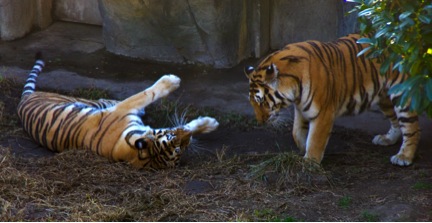
Make sure the ‘mask’ window is viewable (if not Window>Masks) and move the feather slider to the right.  You should see a noticeable increase in sharpness as in Fig 14.  Notice the Density slider. If this slider is moved to the left, the effect of the mask is reduced and the image will approach its original appearance.  So if you want it a little bit darker, go for it.  I’m leaving it where it is now. 

Fig 14: Feather slider in Mask window to increase sharpness.


Fig 15: The tigers can now play


References:
Margulis, Dan "Photoshop LAB Color - The Canyon Conundrum and Other Adventures in the Most Powerful Colorspace," 2006, Peachpit Press, Berkeley.
Mark Lindsay, M.F.A. and a presentation to the Berkeley Camera Club on March 28, 2012
see Mark's work at marklindsayart.com